Lizard Squad
WHAT, HOW & WHY.
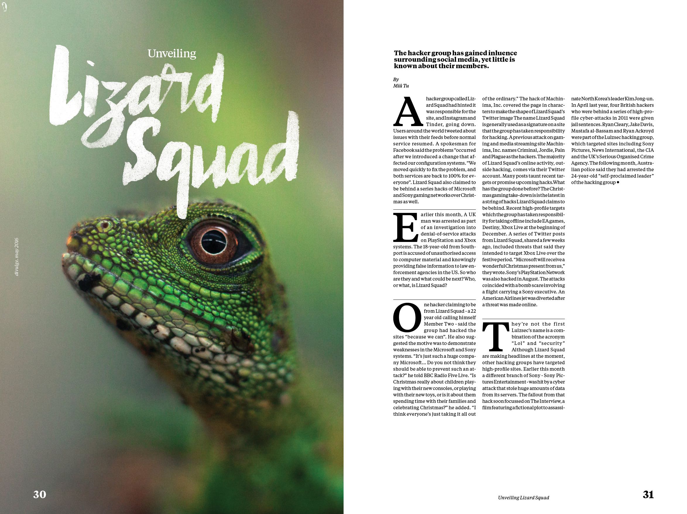
This is a calligraphy assignment in which the goal was the creation of a headline. It could be of any publication, real or not, and any subject. I chose to include it in a editorial project I was already working on, and decided it would fit the narrative of an article about Lizard Squad, a well-known hacking group.
By using normal calligraphy tools; pen, ink, paper and a scanner. Also, a lot of mistakes just to get the most appropriate feel to the traces.
I'm particularly fond of this project because I started out the course knowing absolutely nothing about calligraphy and how to make gothic or baroque fonts and headlines. Also, I'm left handed, so every tool was reversed from my point of view. Oriol Miró, the tutor for the class, had a Saint's patience with me as it is very unintuitive to teach an entire course in reverse to a single student.
INK AND DON'T THINK
I thought you needed a weird particular talent to do great calligraphic work. It turns out all you need is practice. It's not that complicated once you know all the rules and how to bend them, although you do need hundreds and thousands of hours of working on that trace that isn't perfect yet.
Evidently, I'm not that guy that practiced thousands of hours. But I did come up with a comfortable way to use ink and water despite my handicap. Actually, towards the end I was doing traces and shapes that were pretty much unobtainable without turning the paper 90 degrees or holding the pen in a weird way, at least for right handed people.
While I was coming close to what I thought was a decent result my mind kept going to Photoshop, and thinking how many hours it was gonna take me to make it look good. The ink dried unevenly and I couldn't get that flat, uniform stroke. After thinking about it for a while, I decided to not alter the shapes at all, not even filling them or re-tracing them. I figured that it was more honest to have something organic all the way than a unnatural product of digital manipulation.


IT WORKS
As I saw the assignments of the other students, I thought before presenting "Yeah, I'm going to fail for sure". It's not that the calligraphy was bad, it's that it wasn't what the tutor wanted.
All the other headlines were flat, solid and perfectly defined, and mine looked old and a bit wasted. But it looked fine. You would glance at a magazine article with those strokes and you'd think "it just works".


And that was the verdict. I was perfectly happy with "it just works" because I started the course thinking I was going to hate it, but ended up really comfortable and with my own way of tracing and doing strokes.
TUTOR: ORIOL MIRÓ.
